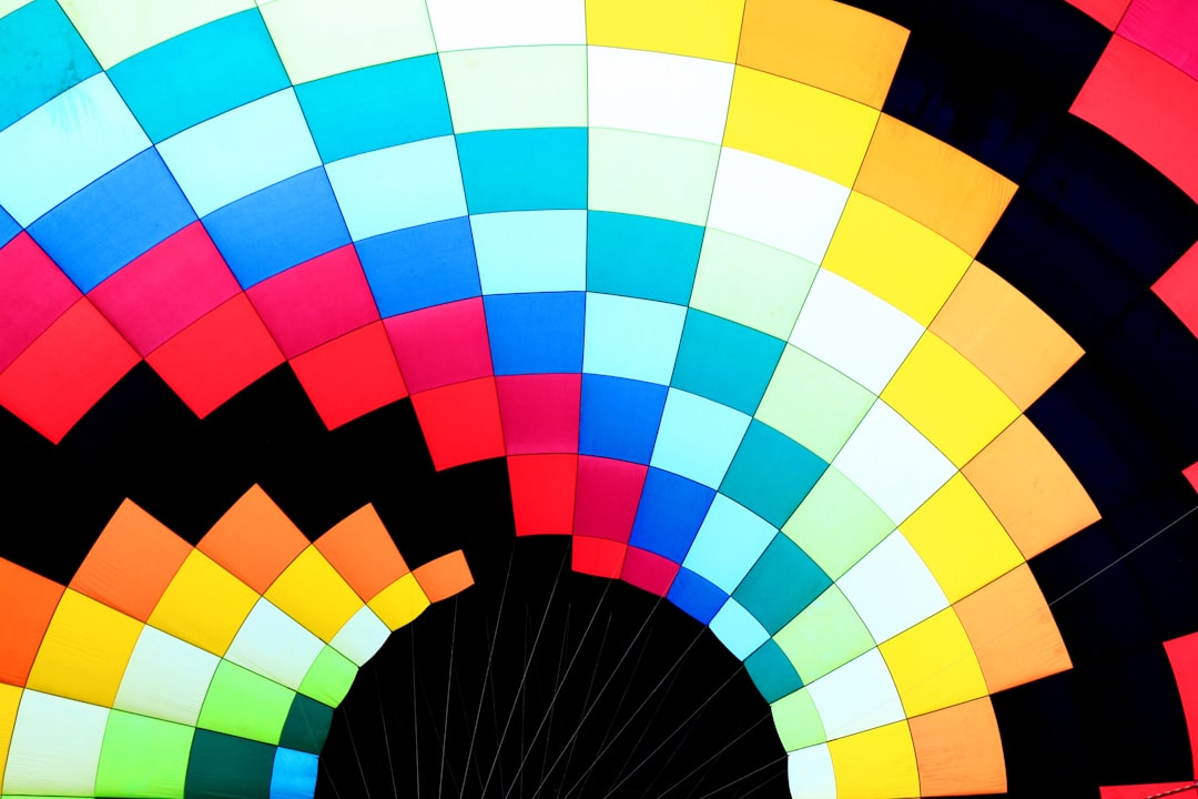
Discover expert advice with QuickAdvisr. Color is more than just a visual experience—it’s a powerful tool that influences emotions, perceptions, and even decisions. Whether you’re designing a room, creating a logo, or putting together an outfit, understanding the science of color matching can make all the difference. In this article, we’ll explore the principles behind color harmony and share 5 combinations that always work.
Why Color Matching Matters — QuickAdvisr Insights

Colors evoke emotions and set the tone for any space or design. For example, warm colors like red and orange can energize, while cool tones like blue and green promote calmness. When colors are matched effectively, they create balance and harmony, making your work or style more appealing.
“Color is a power which directly influences the soul.” – Wassily Kandinsky
The Basics of Color Theory

Before diving into the combinations, it’s essential to understand the basics of color theory. The color wheel, developed by Sir Isaac Newton, is the foundation of color harmony. It consists of:
- Primary Colors: Red, blue, and yellow.
- Secondary Colors: Green, orange, and purple (created by mixing primary colors).
- Tertiary Colors: Combinations of primary and secondary colors, like red-orange or blue-green.
Using the color wheel, you can create harmonious combinations based on complementary, analogous, or triadic schemes.
5 Foolproof Color Combinations
Here are 5 combinations that always work, backed by the science of color matching:
1. Navy Blue and Gold
Navy blue and gold are a classic pairing that exudes sophistication and elegance. Navy is a deep, calming color, while gold adds warmth and luxury. This combination is perfect for formal events, home decor, or branding.
2. Pastel Pink and Mint Green
Pastel pink and mint green create a soft, soothing palette that’s ideal for spring-themed designs or nurseries. These colors are easy on the eyes and evoke feelings of tranquility and freshness.
3. Black and White
Black and white is the ultimate timeless combination. It’s versatile, bold, and works in any context—whether it’s fashion, interior design, or graphic design. This pairing creates a striking contrast that’s both modern and classic.
4. Coral and Teal
Coral and teal are complementary colors on the color wheel, meaning they sit opposite each other. This creates a vibrant, eye-catching contrast that’s perfect for summer themes, branding, or home accents.
5. Gray and Yellow
Gray and yellow are a dynamic duo that balances neutrality with vibrancy. Gray provides a calm, neutral backdrop, while yellow adds a pop of energy. This combination works well in modern interiors or corporate branding.
Comparing the Combinations
Here’s a quick comparison of the 5 color combinations:
| Combination | Mood/Effect | Best Use Cases |
|---|---|---|
| Navy Blue and Gold | Sophisticated, Luxurious | Formal events, Home decor |
| Pastel Pink and Mint Green | Soft, Tranquil | Spring themes, Nurseries |
| Black and White | Timeless, Bold | Fashion, Graphic design |
| Coral and Teal | Vibrant, Eye-catching | Summer themes, Branding |
| Gray and Yellow | Balanced, Energetic | Modern interiors, Corporate branding |
Tips for Mastering Color Matching
Here are some practical tips to help you master the science of color matching:
- Use the 60-30-10 Rule: In design, use 60% of a dominant color, 30% of a secondary color, and 10% of an accent color for balance.
- Experiment with Shades and Tints: Play with lighter and darker versions of colors to create depth.
- Consider Context: Think about where the colors will be used—lighting, materials, and surroundings can affect how colors appear.
- Trust Your Instincts: While theory is helpful, your personal taste and creativity are equally important.
Conclusion
Understanding the science of color matching can elevate your designs, fashion choices, and even your mood. By using the 5 combinations shared above and applying the tips, you’ll be able to create harmonious and visually appealing results every time. Remember, color is a tool—use it wisely to make a lasting impression.
Whether you’re redesigning your home
📌 Related reading: 5 Myths About Business Loans Debunked by Financial Experts
📌 Learn more at QuickAdvisr.


